HALL OF DISMAY

Here we ear-mark some of the bigger on-line names for making obvious mistakes in user experience design and the resulting pitfalls. These issues should be considered in all website UX planning and can impact the engagement of users and the percentage of conversions you're likely to achieve.
 

Obstructions On Checkout

http://www.surfstitch.com

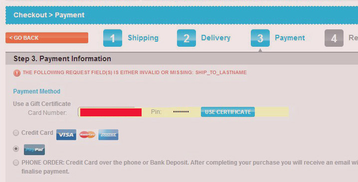
Once your consumer has identified a need for your product or service by adding to cart and clicking 'checkout' even the smallest of difficulties introduced after this point can still impact your conversions and bottom line. In this article we give you some basic tips to ensure your checkout is as seemless as it can be. We also identify a fairly obvious purchase blocker on Surf Stitch that's likely to cause some grief for their consumers but should be straight forward to solve.

Read more ...

Reach the Tallest Peak

To be the best you can be, you need to optimise your content to convert and to keep your audience returning. The trick is to continually monitor and learn from your users, for even the seemingly insignificant could potentially be holding you back.

Forcing Users To Click More

http://www.askmen.com/

With one-pager websites becoming the norm and unequivocally debunking the old myth of 'no body looks below the fold' unfortunately plenty of websites are still forcing their users to click through additional pages on a single topic in the attempt to keep their page content 'shorter' or 'more engaging' when all they're really doing is making it more difficult.

Read more ...

Coming Up

  • Over stimulation and clutter
  • Lost or missing call to actions
  • Confused and unclear messaging
  • Counter-intuitive UI
  • Poor categorisation
  • No CRM program - adopters are your livelihood
  • Blocking path to purchase
  • End zone - a one-way street for bounces
  • Long page mistakes
  • No tracking, no monitoring, no learnings


UX